
Thing King brand identity and website
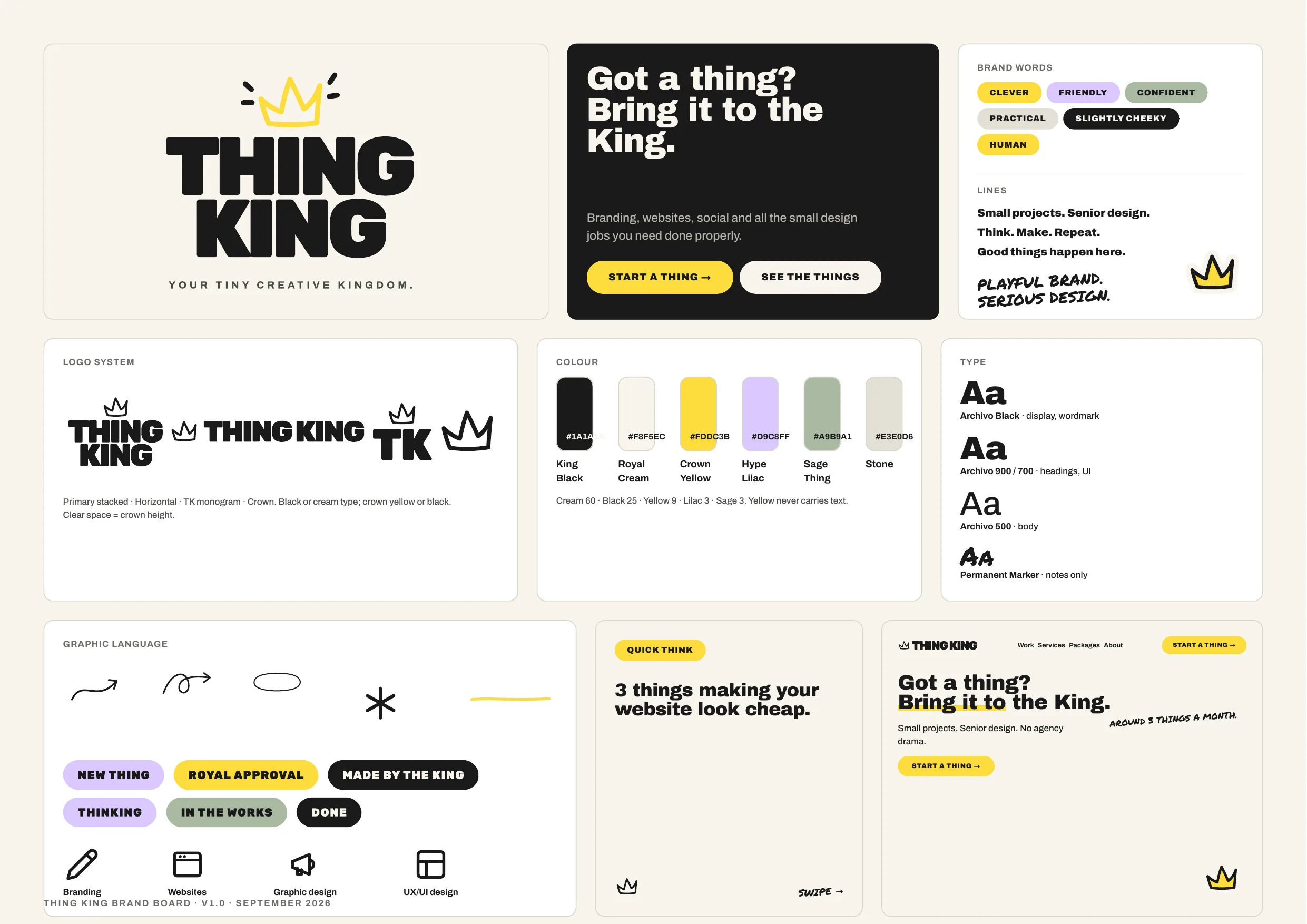
A complete mini identity for a small studio: crown, wordmark, colour and type tokens, and a website built directly from them.
The thing
Thing King needed to look like a considered, senior creative studio from day one. The identity had to work at favicon size and on a poster, stay playful without turning childish, and give the website a real design system to build from rather than a mood board.
The problem
A studio selling senior design has to prove it in its own branding. The risk was a king theme that tipped into gimmick, or a system so loose that the website would drift from the brand within a month.
The thinking
One device, one gesture.
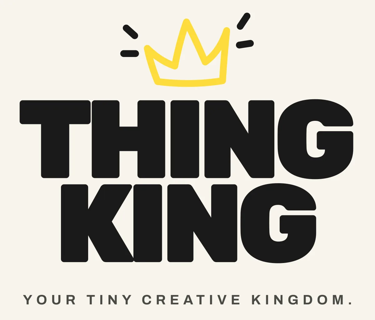
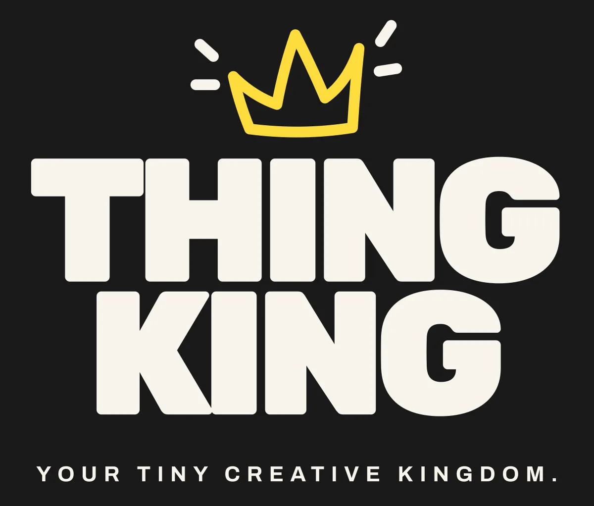
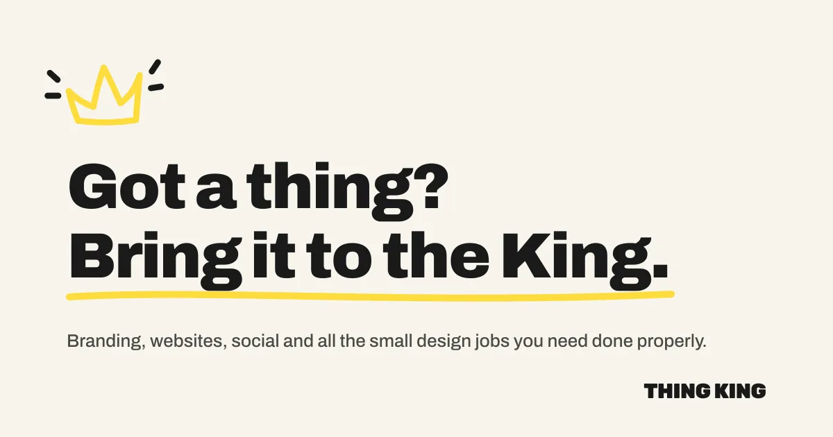
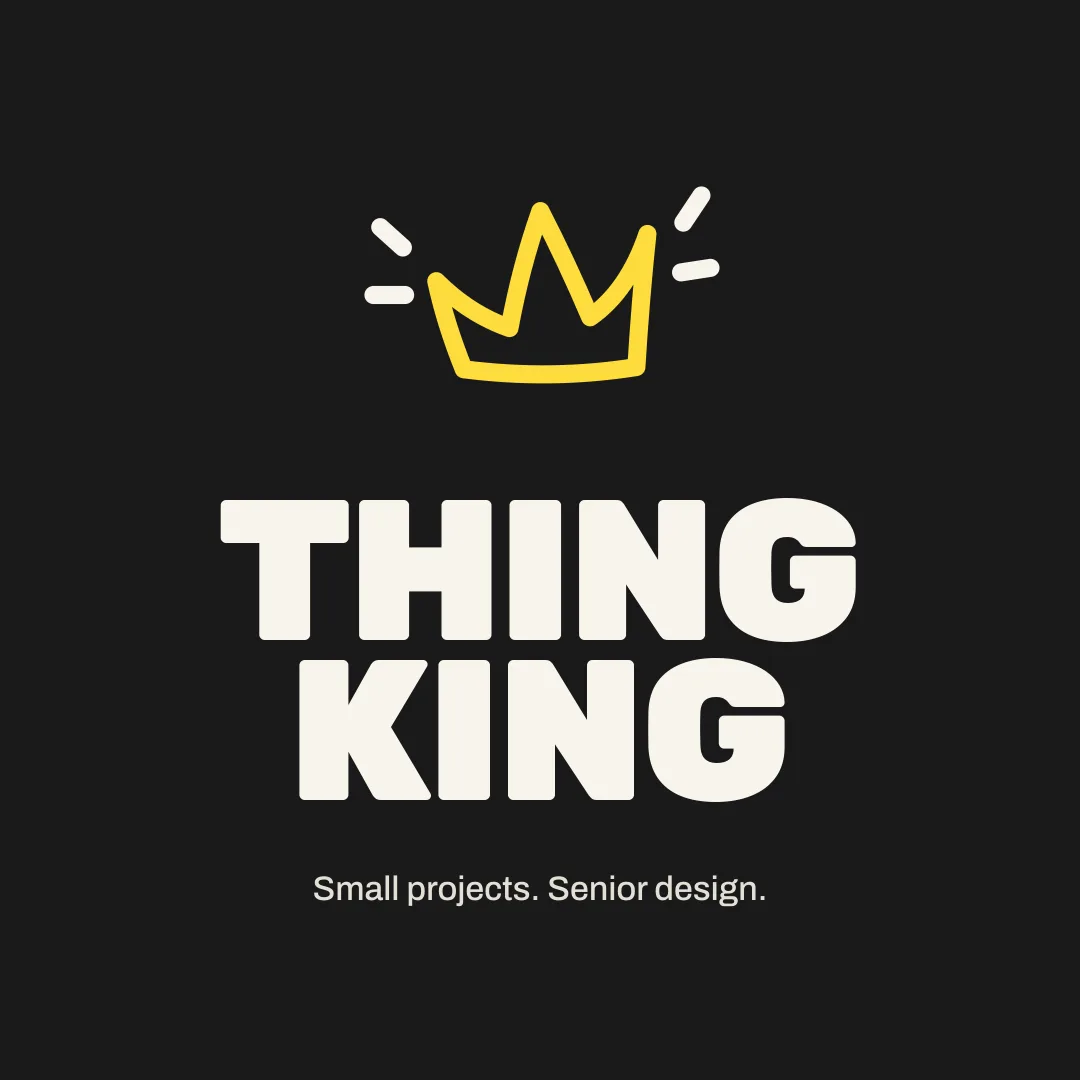
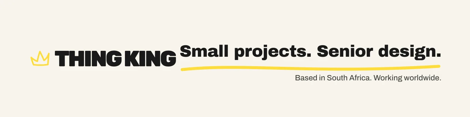
One direction, developed properly. A hand-drawn three-point crown as the single brand device; a chunky uppercase wordmark with THINK hidden inside THING KING; a cream and black editorial palette with one signature yellow and two quiet supporting tints; and a small marker-pen graphic language of arrows, underlines and badges. The rule that shaped everything was one gesture per layout.
Colour tokens
- King Black #1A1A1A Type, buttons, black sections
- Royal Cream #F8F5EC Background
- Crown Yellow #FDDC3B Signature accent
- Hype Lilac #D9C8FF Badge tint
- Sage Thing #A9B9A1 Badge tint
- Stone #E3E0D6 Neutral badge, dividers
Type system
- Archivo Black · display headlines
- Archivo 900 · headings and buttons
- Archivo 500 · body copy
- Permanent Marker · handwritten notes only
The make
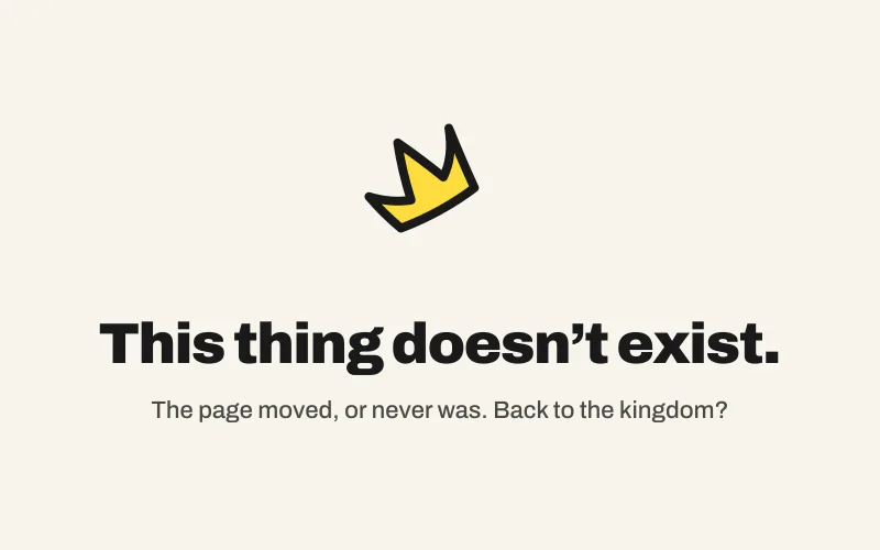
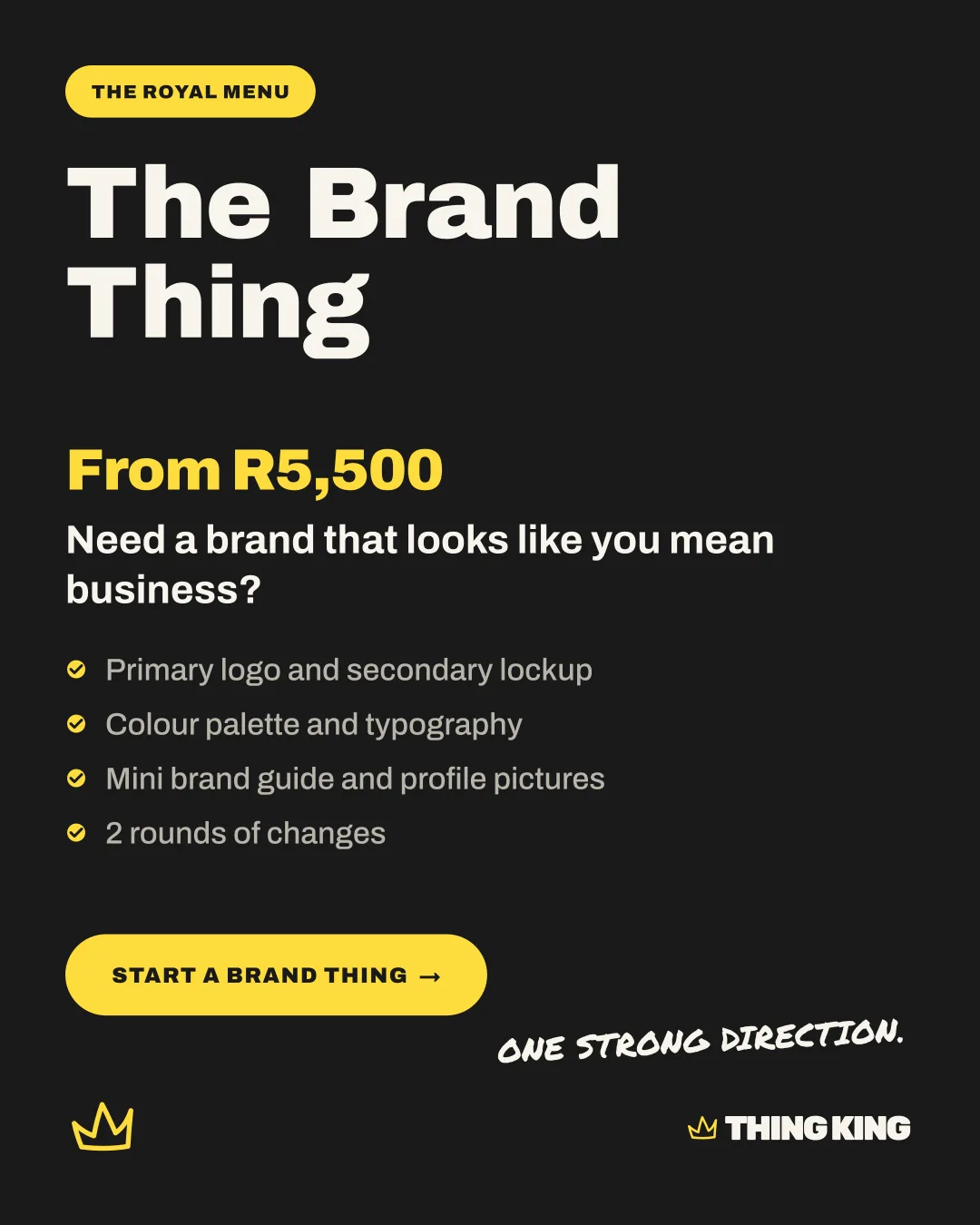
Logo system in every variant, colour and type tokens, a six-icon service set, badges and graphics, favicons, share images, a 24-page brand guideline and a versioned asset package. Then this website, built straight from those tokens: cream background, black sections at most twice a page, yellow reserved for the crown, the primary button and the marker underline.
The result
One brand, one set of tokens, and a website, a social kit and a guideline that all draw from them. Every layout gets exactly one playful gesture.
Got a brand thing?
Tell us what it is and what it should do. You’ll hear back within 2 business days with a price and a plan.